
JULIE SULLIVAN BRACE, Shine Creative Industries, Flagstaff

We use the term “seasoned professional” to describe creatives with decades of experience. It’s a good way to describe the visual flavor profile of Julie Sullivan Brace of Shine Creative Industries in Flagstaff. She has been practicing graphic design long enough to be fortunate enough to choose only clients who are doing things that she believes in. The result is a portfolio that shows her creative talent activated by clients whose ideas and initiatives resonate with her and her team.
I spoke with Julie about her work and her journey, from Pittsburgh to San Francisco to Flagstaff. Because I’m rather “seasoned” myself, we enjoyed some serious laughs about paste-up, stat cameras, and other adventures in caveman graphic design before the dawn of the Apple Macintosh. (I can assure you that this “Jules of the South” will be making a visit to “Jules of the North” sometime soon!)
(Jules of the South) There is a personality and a tone to your work that has been manifested by the kinds of clients you have. You choose them—or they choose you—based on some core values and a sense of place: music, the local and Native communities, healthy living, preservation of air, water, & land, outdoor education, etc.…. It’s really cool to see such a curation of clients, with the wonderful things they do, brought to life in your graphic design.
(Jules of the North) “I have clients that have been with me for 20–30 years. PEAK is one client we have rebranded several times. I’m attracted to eccentric clients, and vice versa—I seem to gravitate toward nonprofits and I seek people who are visionaries and have big ways of thinking. I thrive on really listening, learning, and being able to translate those big ideas visually.”
There is a refreshing clarity to your work. The words are edited for impact and brevity, and the use of photography is carefully researched. (It helps that you live in a place with such fantastic natural beauty that inspires great photography.) The use of images in the Canyon Explorations website is stunning. Love the video of the clouds moving over the mountain on the PEAK Learning website—nice art direction, to use the powerful image and add just the right amount of video.
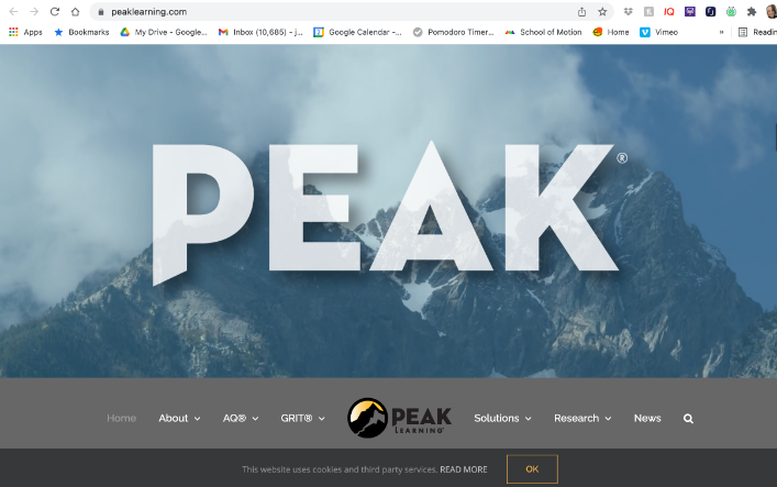
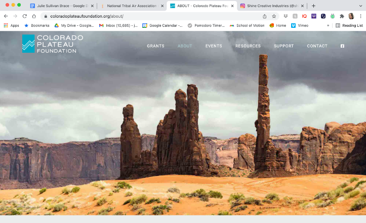
(Left) Website design for PEAK Learning, a Fortune 100 business that empowers entities through understanding and boosting their Adversity Quotient—Julie Sullivan Brace, Art Direction & Branding Design. Lara Gomora: Design, Web Development. (Right) Website design for Colorado Plateau Foundation, a regional foundation that empowers Southwest Tribes with funding and necessary resources to protect their lands and values.
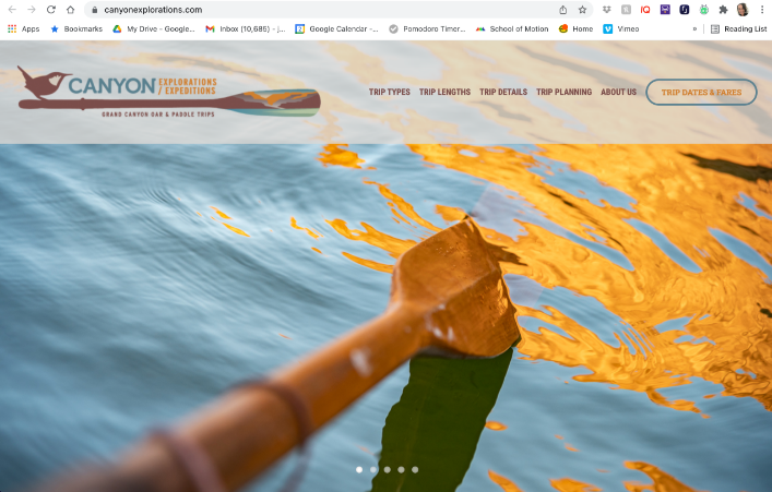
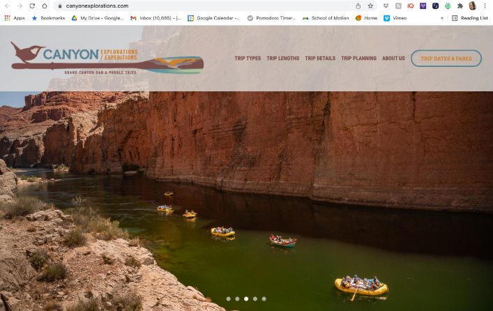
Two views from the home page of Canyon Explorations website, the oldest whitewater rafting company on the Colorado River through Grand Canyon.
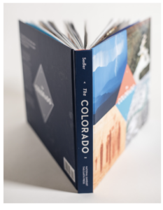
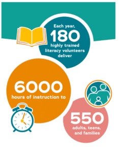
(Left) The Colorado book design. (Right) Infographic from The Literacy Center website.
Everywhere the typography is clean and designed for the reader, intentionally. The Literacy Center website is a great example of type carefully designed for the English language learner: simple and clean and baked into the infographics as well as the narrative. I was also inspired by the work for Full Circle thrift, a great project for the community which didn’t stop at the naming and logo—your team also collaborated on the design of their business model.
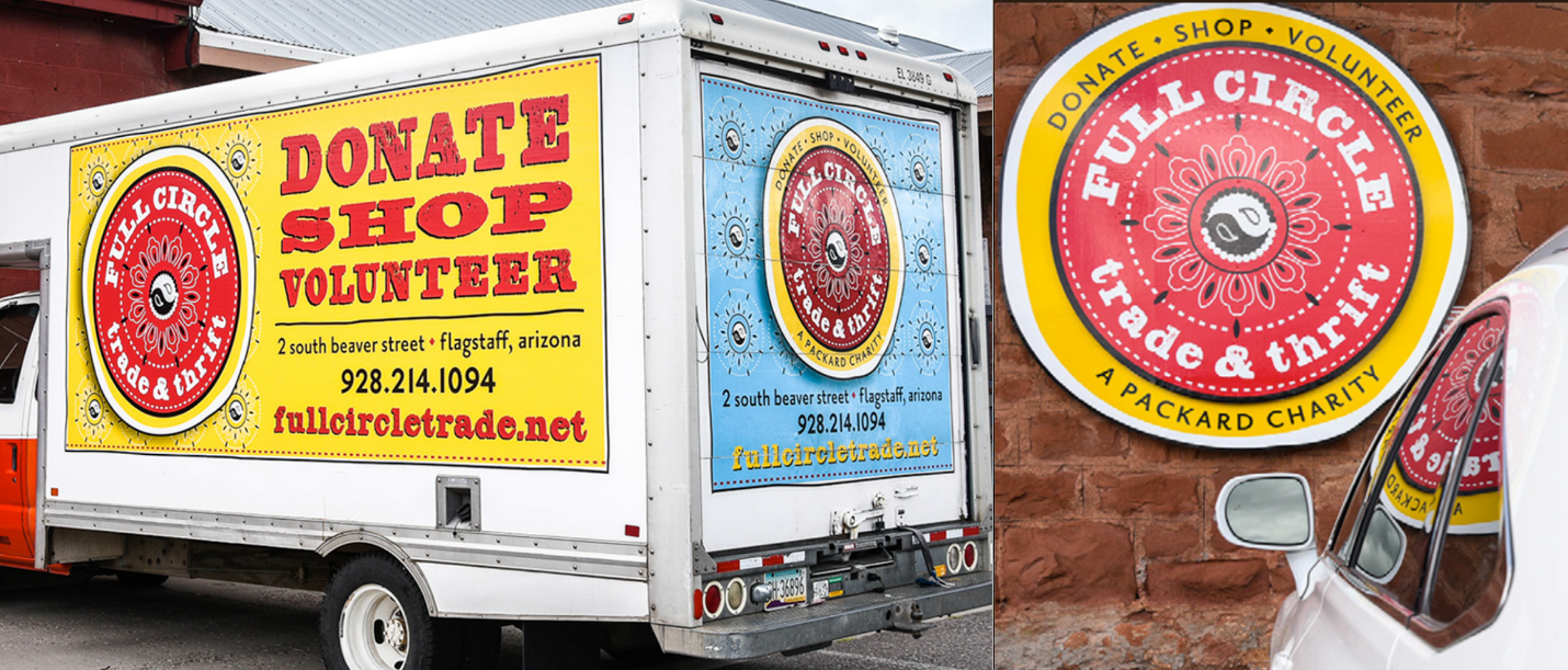
Naming, logo, and business model for local charity Full Circle Trade & Thrift.

“I seek people who are visionaries and have big ways of thinking. I thrive on really listening and being able to translate those big ideas visually.”
Music is one of those big ideas. I understand you are very active in supporting the music community in Flagstaff, especially with the festival Pickin’ in the Pines—which you helped found and curate—and have even performed at it—every year. This year marks, what, sixteen years of your work and support of this group, is that right? The poster collection is wonderful—great fun you’ve had with typographic illustration.
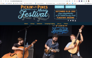
Logo and website for Pickin’ in the Pines music festival.
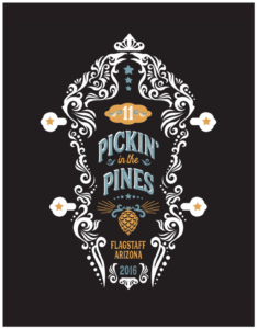
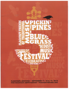
Two posters from the annual Pickin’ in the Pines music festival, an event Julie co-founded 16 years ago, and continues to advise on curation each year, and still even performs occasionally.
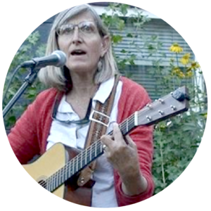
“There was always a lot of creativity flowing through our home when I was growing up. My mother was a jazz vocalist and my father also dabbled in music. Even my grandmother painted—I remember she painted these metal TV trays with bouquets of flowers. I had no idea what graphic design was until my high school art teacher enlightened me to the idea that there was a career path as an artist. These skills and my music background have helped me to channel creativity and support for musicians which is very important to me. I think I will always think of my mother as that aspiring and talented singer burdened with three kids in diapers. I’ve always wanted to honor her. So, yeah, I have a strong drive to support musicians.”
It’s fun to meet someone else who was around and practicing graphic design before computers, LOL!—as soon as we are done laughing about this, tell me about your early career. Pittsburgh, San Francisco in the 90s—did you meet the Michaels?—and certainly Flagstaff.
“Yes! I was around in that dinosaur age, left that Rust Belt before it was the Rust Belt, and went to San Francisco. I found myself working for the May Company, a retail giant, drawing pots and pans and taking stuff to the photography department, dealing with darkrooms and toxic chemicals, etc. It was very ‘Madmen’-like: very few women, always a cocktail on the desk. I learned there to be quick and creative, and was trained as an art director. I started freelancing in retail at first, at Macy’s San Francisco, when Richard Avedon was redefining fashion photography. Yes, I interviewed with all the Michaels! I had the good fortune to work with David Lance Goines, a very talented graphic artist in Berkeley. At that time I was living in the east bay, and after several challenging experiences working for others, I started freelancing and just never stopped.”

“It was very ‘Madmen’-like: very few women, always a cocktail on the desk. I learned there to be quick and creative…”
“I always had an office, that was always important. Being a freelancer gave me the flexibility to pursue the music scene. I moonlighted as a barmaid at the Albatross pub, and across the street was the Freight & Salvage, a hole-in-the-wall coffee house in a derelict neighborhood that hosted amazing bands most nights—lots of bluegrass, so good. I did all the posters for the bands and the monthly calendar which was a mashup of photographs, or hand-drawn images, if no one provided the art. It was a good time, and being around the music fed my creativity and musical development on multiple levels.”
I think that you can really see, in your logo designs, the skill and ease you have with letterforms. There is such a great mix of classic, stable, composition with some whimsy and humor added, as well as your ability to extend the design to the whole visual system, including packaging and signage.
What do you want to say to younger and older creatives?
“To older creatives, I would like to inspire you to just continue practicing. Because of the speed with which things are changing, it can be challenging to stay viable in the industry. At the same time, the well-practiced ability to listen, and the life skills we pick up through good and bad experiences, are more valuable than you might think. I try to always work with interns, and learn from them, while they also learn from me. I think we have things to say, as mentors.
To younger creatives, I would like to say: keep pushing until you get there. Sometimes the first leap is not any better, but it can always be good for learning what you don’t want.”
[to younger creatives]: “…keep pushing until you get there.”

(Above, last logo image) Yoga Experience logo: Julie Sullivan Brace Art Director; Lara Gomora, Designer
“Graphic design is about way more than your creative skills.”
How is your business growing at present?
“We are lean and mean, and I’m really grateful not to be grasping at projects. My longtime employee (and friend) Lara Gomora is an incredible designer and asset to our team, acting as collaborator on all of our projects. We can pick and choose. I really appreciate balance and the creative process. At this point I don’t want to educate clients who don’t get it. When you understand that so much is about relationship building, you know enough to know with some folks, it’s just not going to work. That’s one reason why I think we’ve been able to keep some clients for a long time. Our value to them comes from a deepening level of connection through communication and time. If you want to carve your own way and run your own shop, you must have the communication skills to work with people and be the translator of their needs. Graphic design is about way more than your creative skills.”
Now that would be a great tagline for Julie and her team at Shine Creative Industries.
Contact Julie at Shine Creative Industries:
[email protected]
928.779.1120