
The Lord of the Logo
The Lord of the Logo

A conversation with Steffan Stewart
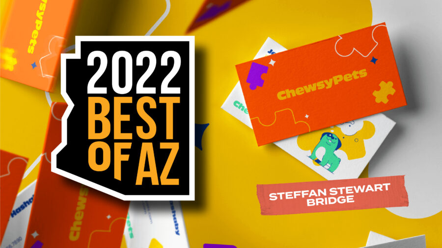
Winner of AIGA Arizona’s Best of 2022 exhibition at Phoenix Design Week
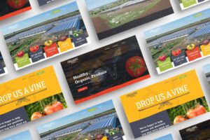
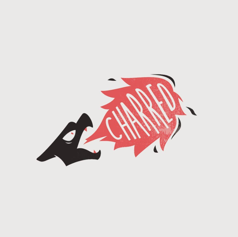
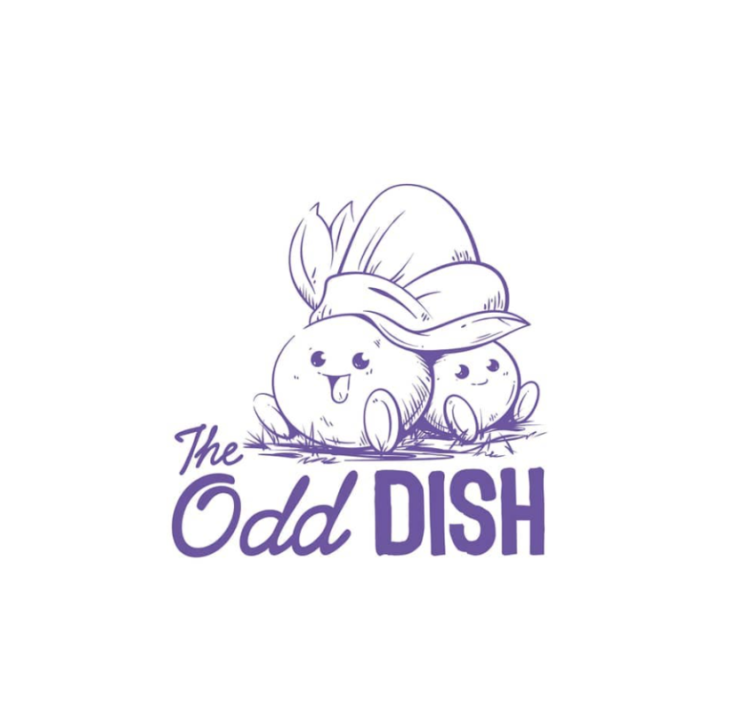
Brand Identity and Visual System for ChewsyPets
Julia (AIGA): Congratulations on on receiving the most Best of 2022 votes from Phoenix Design Week attendees! I understand you are now a two-time winner. Big shout out to you and your co-director Colton Barry for scoring another award for your agency, Bridge.
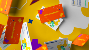
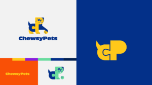
The brand identity for ChewsyPets follows the same high standard that we can see throughout your portfolio of work: clean, clever, and delightful. I love how successfully the puzzle pieces explain the concept of custom play, and how you got into the brain of a dog to choose the color palette of yellow and blue—the only colors a dog can see. Can you tell me more about the process of designing this logo and visual system?
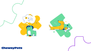
Steffan: ChewsyPets is a startup with a mission to create a brand that recognizes that your pet is as unique, individual, and as picky as any member of your family. Why spend money blindly on pet toys when attacking an empty cardboard box is the preferred choice? ChewsyPets wants you to enjoy the process of engaging with your pet, and finding out how to enhance their playtime experience with toys selected by and customized just for them.
We ran the team through a brand workshop to better define their goals and values, in order to establish visual elements for the brand that really communicate these ideas.
What do you do in your brand workshops?
Some things we cover are questions about the brand, centered around their “why”, their goals, demographic, history, etc. as well as journey mapping for their users, defining brand personality, and sometimes a level of positioning. Depending on the client and their needs, the workshops can be leaner or more drawn out and generally go anywhere from 2-5 hours. All of the info from these workshops allow us to define the business, their mission, personality, tone, and demographic, so we can build a brand with a story uniquely targeted to their clientele.
I can see that process really helps you organically arrive at the naming and the elements of the identity system!
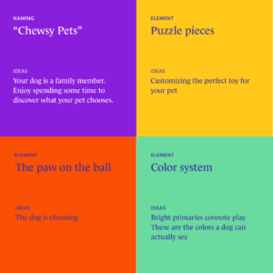
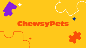
Exactly. Starting with the logo, the concept they chose utilized puzzle pieces which I felt was a fun and playful way to communicate crafting the perfect toy, and the paw on the ball helped to indicate your pet selecting their toy of choice. The team was overjoyed with this direction, and after approval we dove into the visual system. The bright primary colors were intended to communicate a fun and playful atmosphere, and we leveraged blue and yellow as the primary colors as they’re the only colors a dog can see. This added another fun layer of meaning to the system! I’ve been having a lot of fun with this brand and we are working on the website now. Of the hundreds of brands I’ve built over the years, this one is definitely one of my favorites!
ALWAYS ARIZONA
Tell me about how you happen to be here in the Arizona desert, and how your journey got you into co-founding your agency, Bridge, with Colton Barry.
I actually grew up in Arizona and graduated from Grand Canyon University in 2014. Shortly after graduating, I started working at an in-house design gig in Tempe, where I met Colton. He had been at the company for a couple years and we built a great team together, working our way up to Art Director roles. After a little over a year there, I left to start my freelance career, and Colton happened to do the same. We remained friends and kept in contact for a while, having helped each other with projects from time to time. Colton was working on a lot of website projects along with general graphic design work, while I was taking on a lot of branding, logo, and illustration projects. We eventually decided to bring our practices together to form Bridge, and the rest is history!
It’s great to have the right creative business partner…I can always be my best creative self.
My focus is on illustration and branding, and his focus is more website design/development, so when we joined forces, we found that our skill sets were very complementary. We’ve been going strong with Bridge for nearly five years now. It’s great to have the right creative business partner. We’re not only very close friends, but we truly work really well together and I can always be my best creative self.
I was that oddball kid, always with my nose in a sketchbook. I grew up in a creative family; my father and grandfather both being professional Western painters/sculptors. I never really sat and thought about what I wanted to do–I guess you could say being creative is in my blood!
I never really sat and thought about what I wanted to do.
That explains why you simply breathe and make great work. Of course I know it’s a lot harder than breathing!
THE LORD OF THE LOGO
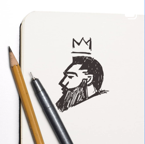
You are like what they call in theater a “triple threat.” In your logo work, I can see 1) a mastery of figurative, dimensional illustration; 2) bold, confident graphic representation; and 3) imaginatively integrated, thematically-abstracted typography. Do you feel like, among those three skills you can use so well, is there one that you either prefer or that takes over?
No, not really. I honestly just love putting myself out of my comfort zone to try new things. I am very committed to pushing myself and I try to avoid complacency–I try to keep things fresh, and don’t have a particular “style” I sit with. Whether it’s logo design or illustration, I always want to try something new and further expand not only my skill set, but to always be on my toes.

I just like to make things. When I see something cool, I try to do it in my own way.
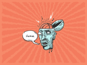
 I’ve always believed in the Pablo Picasso quote: “Good artists copy, great artists steal.” The irony is that just copying someone’s work without fully absorbing it and making it your own is actually theft. But when I see a cool style or technique that I gravitate toward, I try to make time for a personal project to attempt that technique or style in my own way. One example of this from a few years back– there’s this amazing designer Tommy Washbush (@washbeast on Instagram) with a very weird but cool 90s Nickelodeon-esque style. He uses some interesting shading and texture techniques using very organic, rough, free flowing lines, and I decided to attempt that shading style for one of my own illustrations just for fun (Slamm). Definitely check him out–his T. Hanksgiving illustration is one of the best things you’ll ever see. May take a bit of scrolling, but it’s totally worth it!
Overall, I just like to make cool things, and I hate the idea of doing things the same way every time. I’m also very competitive, so when I see one of my friends working on something rad, it just pushes me to work even harder.
Do you have any favorites out of all your logo work?
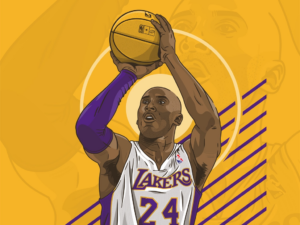
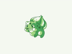
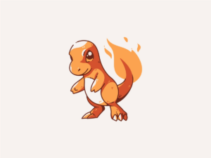
I’ve made hundreds of logos across dozens of different styles over the years, so that is a very hard question. ChewsyPets is definitely one of them, but I also started a personal project years back to design a logo for every Pokemon character. There’s a handful of those I’m really happy with!
HELPING YOUNGER DESIGNERS
“Do NOT put pineapples on top of a truck and do NOT call it Pineapple Express.”
I really, really love the pineapples on the rushing truck.
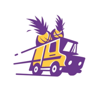 That’s a funny story: I taught a Design Thinking class at GCU for a semester and tasked the students to design a logo for a pineapple delivery service. I challenged them to NOT be literal, and to think beyond the obvious: “Do NOT put pineapples on top of a truck and do NOT call it Pineapple Express.” Then I had some extra time and had fun doing exactly that, just to mess with them. Imagine their surprise– “You told us not to do that, but did it yourself!” But it was all good fun; they could see that the difference was that I know what I’m doing. Even funnier, this logo that was intended to be a joke/fun personal project was featured in LogoLounge this year–an annual publication of the best logos in the world, voted on by a jury of renowned logo designers and creative directors!
It’s always been important to me to give back.
Outside of teaching, I’ve mentored a bunch of design students over the years (Namely GCU students). When I was starting out I didn’t know what the hell I was doing (and I still don’t), so I like being able to help foster young creative talent and pass on what I’ve picked up over the years!
***
One thing is for sure, it’s obvious the Lord of the Logo knows precisely how to guide the project through the forest of uncertainty and on to the realm of excellence…
Each year the rallying cry “Show us your best!” is heard throughout our desert land, and creatives from near and far submit their latest work. This past October, we captured the year’s efforts of Arizona designers in a virtual showcase during Phoenix Design Week 2022. Our annual “Best Of” design showcase is unlike traditional shows: there are no judges or juries—in a “people’s choice” vote, attendees vote for their favorite projects each day during Phoenix Design Week. The entry that receives the most votes earns Best Of accolades for the designer, along with a pass to the next year’s event, and a feature article (like this one).
This year, we were back in person with the exhibition, and tried a new voting process. We wanted to offer the opportunity for conference attendees to vote like we used to do—in person, reviewing physical as well as digital submissions—and we announced that at the conclusion of the PHXDW Keep it Real conference (Steffan Stewart). At the same time we wanted to open up a second round of online voting to the community—and announced that winner (John Kenney) at Creative Mornings, the closing event of PHXDW 2022.